 |
Voting in Florida in 2004
|
NB -- This page was last updated on 12/03/04. Since I never found a smoking gun I went on to other things, and no further action was taken on this analysis. Planned actions mentioned in this page, such as pending updates to the links section, were (obviously) not done. I am leaving the page here, however, as I think the analysis is still interesting, and the conclusion that the "null hypothesis" is the correct one is still every bit as surprising as it seemed at the time, given the unexpected voting patterns in Florida.
Overview and Conclusions
I started this page when I first saw the breakdown by voting machine of the results in Florida. Since the way people vote shouldn't depend on the machines they use, it seemed to signal cheating. A careful examination of the voting patterns in Florida in 2000 and in Louisiana in 2000, however, has led me to conclude that the difference was due to the lopsided use of the opscan machines in rural northern Florida counties where there is a preponderance of "Dixiecrats". A statistical analysis of the data from the 1996 election also supports this conclusion. The remainder of this page contains my analysis and reasoning in detail.More interesting at this time is the overall pattern of results for the nation. As has been pointed out by many people, in the "battleground states" the exit polls were consistently skewed to Kerry in comparison with the official poll results. Nowhere did the exit polls show a result skewed to Bush. This cannot have been due to chance; there must have been a systematic effect present skewing either the exit polls or the official results. The official explanations of how the exit polls could have been skewed in the same direction across a number of states seem very "thin". The alternative is a systematic bias in the official ballot counts, which is far easier to understand. In The Unexplained Exit Poll Discrepancy, Steven Freeman makes this point very well. The Wikipedia article on irregularities in the election treats this issue, and many others, in depth.
There have also been many reports of irregularities in the election, particularly in Ohio, Florida, and New Hampshire. Most recently, Bev Harris of Black Box Voting attempted to examine the original election ballots from locations in Florida and found some very serious evidence of rigging; I haven't got the link for that on hand right now but I think it's accessible from the Wikipedia page mentioned above. (I'll try to update the links section of this page, some time soon.)
There is a recount going on in Ohio, and there is one going on in New Hampshire. Some things can be spotted in a recount; others can't. If the vote counts were recorded incorrectly, that will show up. But if the original records were destroyed and replaced with forged records, as Bev Harris found in at least one location in Florida, it may be impossible to obtain a "real" recount -- in such a case, the tracks have been covered. Furthermore, if there was voter intimidation, and a concerted effort to prevent Democratic voters from casting their votes, as we have heard from Florida, Ohio, and New Hampshire, then no recount can recover the data because the data never existed. And finally, in counties where Diebold E-touch machines were used, it is impossible to have a meaningful recount, because no paper record of the voting was made. The only record from those machines is electronic, and changes to the electronic record, or mis-recording of votes by the E-touch machines, does not leave an audit trail.
And now, on to my analysis of E-touch versus opscan counties in Florida.
The Vote in Florida E-Touch Counties
versus Op-Scan Counties
When the Florida voting in the 2004 presidential election is
broken
down by county, and counties which used the Diebold E-Touch machines
are compared with counties which used optically scanned ballots, it
becomes apparent that something is wrong.In the E-Touch counties, residents voted mostly along party lines -- that is, in E-Touch counties with proportionally more Democrats, the vote was largely for Kerry; in E-Touch counties with proportionally more Republicans, the vote was largely for Bush. This is as we would expect: According to exit polls in Florida, about 93% of Republicans voted for Bush and about 85% of Democrats voted for Kerry.
In the op-scan counties, however, the story is very different. There is little relationship between party affiliation in those counties; people in op-scan counties voted for Bush in droves, regardless of party affiliation. This doesn't seem to make sense.
The op-scan machines were used more heavily in the smaller counties, and it's possible that voters in Florida's smaller counties have abandoned the Democratic party in droves, without bothering to change their registration, while those in the larger counties have retained their allegiance. To check that, I split the counties up by number of registered voters. I divided the counties into those with fewer than 50,000 voters, those with 50,000 to 100,000,. those with 100,000 to 200,000, those with 200,000 to 300,000, and those with more than 300,000 voters. In every set of counties, the signal remains: A disproportionate number of votes in the op-scan counties went to Bush.
To compute the "expected" number of votes in each county, I took the proportion of Democratic, Republican, and unaffiliated voters who voted for Kerry, respectively, as reported in the final exit poll numbers by CNN. Those numbers have been "adjusted" heavily to bring them in line with the official tallies but none the less they give us a starting point. By comparing the percentages of voters in each category with the total number of votes cast and the total number of voters in that category, I obtained per-category "turnout" numbers. For each county, I multiplied each category of voters by the category's "turnout" number, and multiplied that by the percentage of that category who said they voted for Kerry, and summed them to obtain an "expected Kerry vote" value for each county.
I then compared the actual number of votes for Kerry in each county with this "expected" number.
Here are the raw results: op-scan-versus-e-touch-by-size
And here are some graphs.
Graph 1: The numbers for the whole state, lumped together:
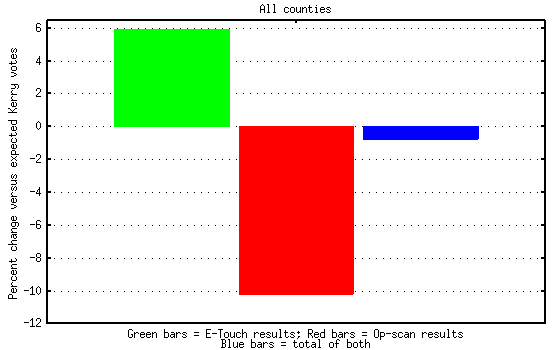
Since the "expected values" were computed using the actual results for the whole state, if the op-scan machines "shorted" Kerry then the "expected values" are artificially low. We should see the (presumably "honest") E-touch machines giving Kerry more than the "expected" number of votes in that case, while the op-scan machines give him less than the "expected" number of votes. And that's exactly what we see in Figure 1: The E-touch machines gave him almost 6% more votes than the "expected" number, while the op-scan machines gave him over 10% fewer votes than "expected".
Graph 2: Broken down by county sizes:
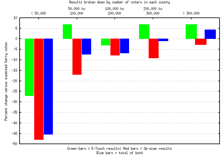
In Graph 2, we see the results divided up into a number of different sets based on the size of each county. As with the numbers for the state as a whole, if the op-scan machines were shorting Kerry, we would expect to see higher values for the green (E-touch) bar for each size range than for the red (op-scan) bars. And that's exactly what we see -- in every size range, counties that used op-scan machines apparently shorted Kerry, relative to counties that used E-touch machines. In the smallest counties (< 50,000 registered voters), it appears that the E-touch machines were shorting him too -- but note that there were only 2 E-touch counties with < 50,000 voters so that may not be conclusive. But what is conclusive is that who got the votes was determined, to a large extent, by what kind of machine was in use -- and that should not have been the case, had the election been honest.
At this time, I haven't done a statistical analysis on this ... but with results this clear-cut, a statistical analysis will just confirm the obvious.
I plan to break down the counties by demographics and check that, if I can find the per-county demographic data online, and I hope to do some statistical analysis on these results as well. But first, I've attempted to make an estimate of how many lost votes were involved; that's summarized farther down the page.
What could be done?
All we need to check this is a recount! People have talked about the paper-trailless machines, and how no recount would help. Well, it looks like the machines without paper trails -- the E-Touch machines -- were actually relatively "straight" this time. The votes that were "fixed" were the ones from op-scan counties, where there are paper ballots.If those ballots haven't already been destroyed, then the final, hard evidence which would confirm or contradict the conclusions many of us have come to is still there. All that is needed is a hand recount.
Who Should Have Won?
If the election had been "clean", who would have won Florida? Since the E-touch machines leave no paper trail, there is no way to be sure.As discussed on this page, there seem to have been serious problems with the votes from the op-scan machines, which probably switched a couple percent of the Florida votes from Kerry to Bush. In addition, we may reasonably speculate that there were problems with the E-touch machines which we cannot detect: There were multiple complaints of E-touch machines changing votes to Bush after a vote for Kerry was entered, there were reports of machines that "filled out" the results before the users touched anything, and there remains a very disturbing upset victory for a Republican candidate in the first election in which the E-touch machines were used a couple of years ago. There were also complaints of scams directed at intentionally mis-registering new voters in Democratic neighborhoods, and there have even been reports of a scam directed at getting gullible Democrats to put off voting until November 3 to avoid an expected crunch at the polls. I can't personally attest to the veracity of any of these reports, but my general impression is that there were multiple problems with the election in Florida; I strongly suspect they account for the loss of at least another half a percent or so of votes that should have gone to Kerry.
Overall, it looks to me like Kerry would have carried the state, had the election been "clean". But of course, I can't prove it.
What Would a Recount Reveal?
Suppose the op-scan county votes were recounted. Would Kerry win Florida?In the absence of either a real recount, or at least access to the complete, raw exit poll data with which to form an accurate estimate of turnout and preferences among the various groups in Florida, we can't be sure. But with the numbers we have we can get an idea.
The turnout and preference values reported in the exit poll data have been "adjusted" to match the official vote counts, and can't be depended on. So, in order to get an idea of how people were voting, I ran a linear regression of Democratic, Republican, and independent/third-party registrations, by county, against number of votes for Kerry in each county. I did that across the E-touch counties, to obtain a baseline. I also did the same thing for votes for "other" (any candidate other than Bush or Kerry). I then ran a Perl script over the registration data for the opscan counties, to produce a synthetic set of "voting results". (The regression was done interactively using R-base. The perl script is here).
The result: Kerry: 50.9%. Other: 0.9%. Bush: 48.2. Kerry wins, with a 2.7% margin.
But this is not conclusive, because of....
The "Dixiecrat" Factor
The Republican party is the party of Lincoln and reconstruction. Traditionally, many conservative residents of southern states will not call themselves Republicans; they register as Democrats but vote as conservatives.I have heard from more than one source that the skew toward Bush in the smaller, more rural counties is due in part to the large number of conservative voters in those counties who are registered as Democrats. Since the skew due to opscan machines spans all sizes of counties, that's clearly not the entire explanation, but none the less there is very probably some truth to it. The effect is visible in a plot of "excess votes" for Kerry versus county population in the E-touch counties, though it seems less pronounced than it does in the opscan counties.
To adjust for this, I fitted a line to the excess/shortage of Kerry votes in each E-touch county, versus the number predicted by the linear model, plotted against county population. I then scaled the votes produced by the model for each opscan county by the "expected excess" for that county size. (Details of the adjustment are in the perl script if anyone's interested. The linear fit was simple least-squares.)
The result: Kerry: 49.3%. Other: 0.9%. Bush: 49.8%. Bush wins by a whisker: 0.5%.
Given the uncertainties of the method, this must be called a tie. Furthermore, a difference of 0.5% is only about 38,000 votes ... and that's smaller than the number of lost absentee ballots from Broward county (58,000 of them!!) and small enough to be swamped by any of the other irregularities in the election.
So, what this really says is ... we need a recount!
The Year 2000 Data
(N.B. -- The year 2000 election data used in this analysis was obtained from the ustogether website. I believe their numbers are reliable but I haven't yet checked them against primary sources to be sure.)I divided the data from the year 2000 election into counties which used E-touch machines in 2004 and counties which used op-scan ballots in 2004. I had no exit poll results for turnout and preference for year 2000 to provide a baseline "expected vote" for each county, so I used a linear regression least-squares fit to the total votes for Kerry in each county, with number of Democrats, Republicans, and independents registered in each county as inputs. I then compared the actual number of votes for Kerry in each county with the number predicted by the linear model, to obtain an "excess votes for Kerry" number.
To assure that the results of the analysis from 2000 and 2004 were comparable, I also reran the initial analysis on 2004 using a linear model of the by-county votes in 2004 in place of the exit poll turnout/preference values which I had used initially to produce Graph 1.
The voting pattern in the "2004 E-touch" counties versus the "2004 opscan" counties which appeared in year 2000 is almost indistinguishable from the pattern we saw in 2004. The "2004 opscan" counties consistently voted disproportionately for Bush in 2000. Since the dichotomy in the equipment used in the two groups of counties didn't exist in 2000 it seems unreasonable to think the skew in 2000 could have resulted from equipment differences.
At this time, it seems to me that it's likely that the discrepancy results from differing populations in the two groups of counties. The opscan counties are primarily in northern Florida, while the E-touch counties are primarily clustered in the south. The population of northern Florida has historically been rather similar to the population in nearby southern states, while south Florida bears more of a resemblance to the states north of the Mason-Dixon line. Dixiecrats -- conservative southern Democrats -- may be far more common in the northern half of the state, which may be the true explanation for the discrepancies.
The raw results are here. The graphs show the breakdown for year 2004 side by side with the year 2000 breakdown. The graph input, which was reduced by hand, is here, and the gnuplot scripts used are linked from the graph captions.
Graph 3: The numbers for the whole state, E-touch versus op-scan, 2004 versus 2000:
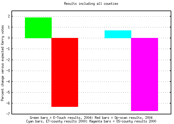
In Graph 3, we once again see the pattern we saw in Graph 1: Compared with a baseline model for the state as a whole, the E-touch counties went disproportionately to Kerry, while the opscan counties voted disproportionately for Bush. The green and red bars are just as they were in Graph 1 -- but the pale blue and magenta bars are for the 2000 election, and they show exactly the same pattern.
Graph 4: Breakdown by county size, E-touch versus opscan, 2004 versus 2000:
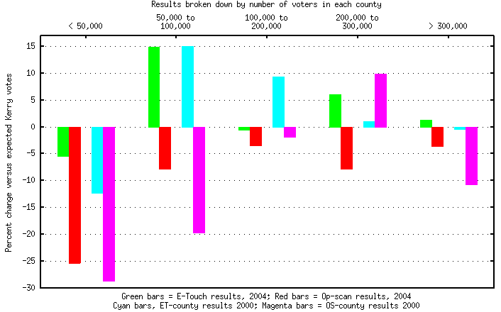
Again, we see the pattern we saw in Graph 2: In every size range, in 2004, the opscan counties shorted Kerry in the reported vote in comparison with the E-touch counties. But once again, the pale blue and magenta bars show the voting of the E-touch and opscan counties in 2000, and the pattern is almost exactly the same as it was in 2004. The same pattern occurs in all but one band: in the range of 200,000 to 300,000 voters, in 2000, we see the opscan counties going to Kerry.
I haven't run statistical tests on these results, because, really, I don't expect to learn anything from that exercise. It's obvious that there's a significant difference between the E-touch and opscan counties. The patterns in 2000 and 2004 are also obviously very similar; even if there are some differences (which statistical tests could help pinpoint) the patterns are close enough to significantly weaken the opscan/E-touch equipment argument.
The Vote in Georgia
The rationale for believing that the opscan results in Florida may be reasonable ultimately hinges on the Dixiecrat vote. But if southern conservatives commonly register as Democrats and then vote for conservative Republicans, then we should see the same effect if we look at results in neighboring southern states. To that end I set out to examine voting patterns in Georgia. No dice.I downloaded the by-county voting results, and then tried to find a breakdown of registered voters in Georgia by party. After wasting large amounts of time downloading and parsing huge voter history files, and finding that the registration numbers broken down by county made no sense (for example, I found 38,000 unaffiliated, 2000 democrats, and 26 republicans in one county) I realized that the information is just not available. A little additional research revealed that Georgia doesn't ask for party affiliation on their registration form. There is no need to declare a party or affiliation of any sort before voting in Georgia, and apparently lots of people don't.
So much for analyzing Georgia.
The Vote in Other Southern States
In addition to Georgia, I've now checked out Alabama, Mississippi, Tennessee, and South Carolina. None of those states asks voters for a party affiliation when they register. In consequence, it's not meaningful to examine the relationship between party affiliation and voting tendency in any of those states, and it is, consequently, impossible to check to see if the "Dixiecrat effect" is present in any of them.That covers all the states abutting Florida and most of the abutting the abutters.
It's worth pointing out that in states which don't ask people to choose a party, there is one less check on the accuracy of the official vote count. And that is never a good thing.
Louisiana
Louisiana asks for a party preference on their registration form. They allow "no preference" but just the same, people are required to say something. And the statistics are available for the state.The registration stats for 2004 weren't online yet when I looked but the stats and voting results for the 2000 election were available. I downloaded them and reformatted them into something I could read, and it appears that the "Dixiecrat effect" exists there, too. So, the explanation of the opscan/E-touch differences in Florida has been supported, at least as far as I'm concerned.
Overall, Louisiana was 60% Democratic in 2000, but voted 53% for Bush. Not one single parish had as many as 50% of its voters registered Republican, and only one even had as many as 40% registered Republican. But many counties have 70% or more of their voters registered as Democrats. This fits well with the assumption that Louisiana, overall, resembles the northern half of Florida.
I fitted a linear model of expected votes for Gore against the number of registered Democrats, Republicans, and others in each parish. I then compared the actual votes for Gore against the number predicted by the model. The percent difference, plus or minus, versus the number of registered voters in each parish is shown in Graph 5.
Graph 5: Excess votes for Gore as percent of the predicted number, against parish size
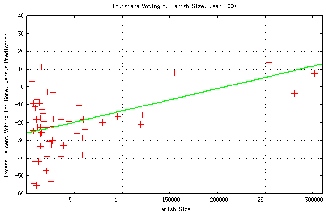
The green line is a least-squares fit to the data. According to R-base, F=15.513 and p(F>15.513)=0.0002103, which in plain English means the graph is every bit as skewed as it looks: Smaller parishes went against Gore, out of proportion to the number of registered Democrats.
At this point, we've seen that the difference in voting patterns between the opscan and E-touch counties was present in 2000 as well as 2004, and we've seen that a very similar effect was present in Louisiana in 2000. The Louisiana skew doesn't look as strong as the Florida skew but that could just be due to a more homogeneous population in Louisiana. This is all consistent with the assertion that the skew in Florida is due to the presence of Dixiecrats in more rural and more northern counties. Additional statistical analysis could tell us more about the strength of the effect and could tell us if the effect was stronger or weaker in 2004 but it could not tell us if something else was going on as well. Statistics can tell us some effect is present but it can't distinguish between two competing real-world explanations that would cause the same numerical effect.
In conclusion, the opscan versus E-touch difference in Florida can't be taken as an indication of election rigging.
The raw Louisiana voter registration statistics for 2000 are here, and the voting results for 2000 are here. The list of parish names and numbers is here. These were all extracted from the Louisiana secretary of state's website. The output of the linear model, with the coefficients for the model and the linear fit to the differences, is here.
Florida 1996 data, and Counties by Latitude
NB -- The analysis in this section which was present on this site on 12/2/04 was incorrect (I forced a 0 x intercept in the multilinear fits when fitting percent voting for Kerry, which makes no sense and made some factors seem far more significant than they were). It has been rewritten. -- 12/3/04As the last step in this process, I analyzed the Florida data from 1996 (Clinton versus Dole). In the 1996 election, there was a Democratic governor (Jeb Bush wasn't elected until 1998), punchcard ballots were in use in much of Florida, there were no E-touch machines anywhere, and Clinton carried the state. So, any "funny business" that was going on in 2004 which had to do with the voting hardware used should have been absent in 1996. The data was downloaded from the Florida website, and extracted into a more readable format here. As I put the data together I looked it over, and it clearly shows the "Louisiana pattern" -- there are counties with 20 times as many registered Democrats as Republicans (e.g., Liberty county).
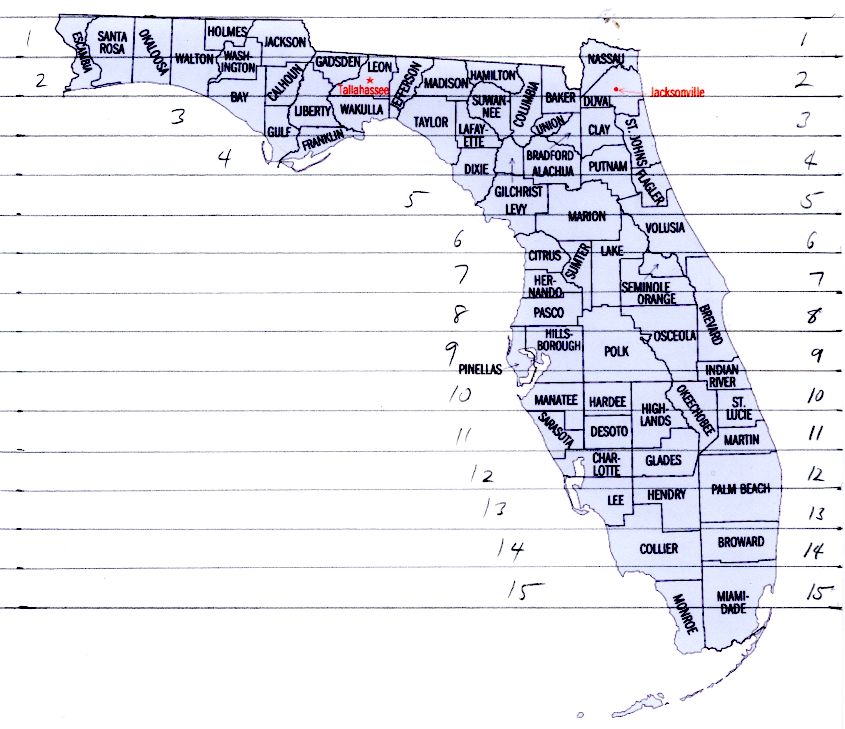
At this point, I also decided to look at county latitudes. It's been my assumption throughout that northern Florida counties have a high Dixiecrat population; if that's so, then latitude should correlate with Republican voting in the presidential elections. I used a very simple approach to computing latitudes: I printed out a county map of Florida and used a ruler to draw lines on it a centimeter apart (see map). Then, by eye, I assigned a number to each county based on the band in which the center of the county appeared to lie; the raw "latitude numbers" are here. The "opscan" versus "etouch" division is based on machines used in the 2004 election, of course.
With this in hand, I did a little statistical analysis on the data, beginning with 1996. I did fitted the number of registered Democrats, the total county size, the latitude of the county, and the type of voting machine used in 2004 (8 years later) to the percentage that voted for Clinton. I did each of these individually. The thing that stands out is that the percentage registered as Democrats doesn't correlate significantly with the percentage that voted for Clinton! This is unexpected. In the northern states, and in the southern Florida counties, people registered as Democrats mostly vote Democratic; people registered as Republicans mostly vote Republican. In Florida as a whole, taken by county (not weighted by population), this is not true.
Table 1: 1996: Factors correlated individually against percent voting Democratic:
| Factor |
Coefficient |
P |
Significance |
| Democratic
registration |
0.04317 |
0.3444 |
Not significant! |
| County latitude | 0.5473 |
0.01408 | Significant |
| County size |
1.843e-05 |
0.0002372 |
Very significant |
| Machine type | 2.548 |
0.2608 | Not significant |
The lack of correlation between registration and voting is surprising, and is, in fact, the issue that we really want to focus on, for it is this exact issue which made the Florida results look "strange" to start with. So I looked at the ratio of Democratic votes to Democratic registered voters in each county, and saw how that correlated with each other factor individually. Let's call the ratio of Democratic votes to Democratic party members in each county the "Dem vote ratio".
Table 2: 1996: Factors correlated individually against (Dem votes)/(Dem registration)
| Factor |
Coefficient |
P |
Significance |
| Democratic
reg., pcnt |
-1.678 |
0.0009599 |
Significant |
| County latitude | 5.711 |
0.02734 |
Significant |
| County size |
2.966e-05 |
0.6267 |
Not significant |
| Machine type | 83.09 |
0.001003 | Significant |
Notice, in particular, machine type is a significant predictor of the Dem vote ratio, even though those machines won't be used for another 8 years. Also note that Democratic registration is negatively correlated with percentage of Democrats voting Democratic! The counties with the largest percentage of registered Democrats are the Dixiecrat counties in the North, where the vote goes largely to Republican candidates.
When a multilinear fit is done of all factors against the Dem vote ratio, whether or not the percent registered as Democrats is included, the machine type to be used in 2004 is still significant, at a level of P=0.0117602. It appears that the "Dixiecrat effect" is smaller in the E-touch counties, even after taking account of county size and county latitude. But again, that factor was present in 1996, and its effect is felt in the ratio of Dem vote ratio for 1996, so I tried fitting that ratio to the voting patterns which were observed in 2000 and 2004.
We start by fitting each factor individually to the Dem vote ratio for 2000.
Table 3: 2000: Factors correlated individually against Dem vote ratio
| Factor |
Coefficient |
P |
Significance |
| Democratic
reg., pcnt |
-1.154 |
< 2.2e-16 |
Very significant |
| Dem vote ratio, 1996 |
0.1303 |
0.0003671 |
Significant |
| County latitude | 3.976 |
4.569e-08 |
Very significant |
| County size |
7.834e-05 |
2.688e-06 |
Very significant |
| Machine type | 36.25 |
1.025e-06 |
Very significant |
All factors we tested were significant. We then do a couple of multilinear fits, using the 1996 Dem vote ratio along with latitude and size, and using the percentage of Democrats along with latitude and size.
Table 4: 2000: Multilinear fit against Dem vote ratio, using Dem vote ratio from 1996
| Factor |
Coefficient |
P |
Significance |
| Dem vote ratio, 1996 |
8.285e-02 |
6.606e-06 |
Very significant |
| County latitude | 2.192 |
1.163e-07 |
Very significant |
| County size |
4.450e-05 |
0.0006904 |
Significant |
| Machine type | 7.148 |
0.354 |
Not significant |
Table 5: 2000: Multilinear fit, using Dem registration in each county
| Factor |
Coefficient |
P |
Significance |
| Democratic
reg., pcnt |
-9.121e-01 |
< 2.2e-16 |
Very significant |
| County latitude | 1.064 |
0.0006914 |
Significant |
| County size |
2.086e-05 |
0.01690 |
Significant |
| Machine type | 4.954 |
0.3236 |
Not significant |
Either way, the machine type is not significant.
Finally, we look again at the numbers for 2004. First we fit each factor individually against the Dem vote ratio.
Table 6: 2004: Factors correlated individually against the Dem vote ratio
| Factor |
Coefficient |
P |
Significance |
| Democratic
reg., pcnt |
-1.189 |
2.783e-15 |
Very significant |
| Dem vote ratio, 1996 |
0.1251 |
0.0005795 |
Significant |
| County latitude | 3.808 |
1.607e-07 |
Very significant |
| County size |
6.182e-05 |
6.646e-06 |
Very significant |
| Machine type | 35.51 |
1.429e-06 |
Very significant |
As in previous years, we see that each factor, individually, is significant. We now do multilinear fits, using either the Democratic vote ratio from 1996 or the percentage of registered Democrats in each county, along with the other factors.
Table 7: 2004: Multilinear fit, using Dem vote ratio from 1996 with other factors
| Factor |
Coefficient |
P |
Significance |
| Dem vote ratio, 1996 |
7.740e-02 |
2.006e-05 |
Very significant |
| County latitude | 2.045 |
5.198e-07 |
Very significant |
| County size |
3.425e-05 |
0.001363 |
Significant |
| Machine type | 8.571 |
0.2741 |
Not significant |
Table 8: 2004: Multilinear fit, using percent registered Democrats with other factors
| Factor |
Coefficient |
P |
Significance |
| Democratic
reg., pcnt |
-9.052e-01 |
< 2.2e-16 |
Very significant |
| County latitude | 1.295 |
0.0001415 |
Significant |
| County size |
1.924e-05 |
0.01576 |
Significant |
| Machine type | 6.060 |
0.2825 |
Not significant |
Either way, we see from tables 7 and 8 that, after other factors are taken into account, the machine type was not a significant predictor of the ratio of Democratic votes to Democratic registration in the 2004 election.
I plan to do up a version of Graphs 1 and 2 using the fit in either Table 7 or 8 to show graphically how the two county types stack up with all other factors included, but I haven't done that yet. -- 12/3/04
But ... But ... But ...
So it looks like the E-touch/opscan discrepancy led nowhere, and I've been barking up the wrong tree. But just because there's no raccoon in this particular tree, does not mean we can necessarily conclude that there is no such thing as a raccoon.The explanation I've seen for the well-known exit poll discrepancies is that Kerry supporters were far more willing to talk to pollsters than Bush supporters. I find this explanation a bit thin. The raw exit poll data varied significantly from the final results in the battleground states, and in each case the exit polls favored Kerry, the final results favored Bush. This is unlikely, unless the final results were cooked.
I've been so tied up in the E-touch/opscan difference that I haven't looked into this, but some others have; in particular, see the Wikipedia link mentioned below.
Tasks Left Undone
I haven't checked the demographic breakdown of opscan versus E-touch counties, beyond noting that most of the mid-sized opscan counties are in northern Florida. I haven't included any scatter plots of the opscan/E-touch breakdown versus voting for Kerry; the differences are very striking when graphed. I've done some preliminary comparisons of voting in each of the two elections using models from the other but haven't gotten far enough to say anything useful about that. And I haven't tracked down the 1996 data, which would be helpful in determining whether there was also something wrong in 2000 which is obscuring problems in 2004 by making the data seem consistent with "historical patterns" in the state.At this point I'm beginning to think this whole line of investigation is not getting anywhere, however, so I don't know how much more time I'll spend on it.
Other Information and
Links
There are many other sites that have performed other analyses on these
data, with statistical checks, as well as sites that have delved into
other irregularities in the election (there were many).See, in particular,
liddle-analysis -- A statistical check of the difference between op-scan counties and e-touch counties, looking only at mid-sized counties in order to rule out a county-size effect. Less than 1 chance in 1000 that the results are due to chance!
FloridaDataStats.htm -- Examination of the data, along the same lines as what I've done but more thorough statistical analysis. Includes some very dramatic graphs, with statistical checks, showing that there's essentially no correlation between voter registration and the reported vote counts in the smaller op-scan counties.
Wikipedia: 2004_U.S._Election_controversies_and_irregularities -- A very nice, rather long Wikipedia article on problems with the election.
I will be updating this page as I have time. Any additional results which I obtain will appear here.
Raw Data and Scripts
Raw data for 2004 was extracted from FloridaDataStats.htm and then checked for accuracy against the state of Florida's website, which contains the election results and voter registration information in a slightly less convenient form. The extracted data is here. The Perl script which did the analysis is here. The data for plots 1 and 2, above, which were extracted from the script output by hand, are here.
Many thanks to the Daily Mirror for articulating the question on so many of our minds..
Page last updated 12/03/04
